I've been working mostly on designs and concepts this week. I have one pattern for a modular design down, and I've been doing a fair bit of research on symbols. This particular design is comprised of a stylized grain pattern, crosses and stars, with meanders. It's just black and white for now as a design. I might do it on a brown egg, however, for more of an earthy feel- if I use it for the egg and the painting, that is. Maybe substitute dark green for the black. I'm not quite sure.
I've also been trying to think of how exactly I'm going to go about my concept. Whether it will be an egg and a painting with different designs to represent the same idea (ex. harvest vs mass-production-processed-food?), eggs and modular designs abstracted from the egg design, traditional eggs and modern designs or modern eggs and traditional designs in paintings. I'm thinking I'll probably just experiment with it, but I'm liking the first two ideas rather a lot.
I've been doing a fair bit of work for my internship in art, which is nice. I made a coloring page of a mural with permission from the copyright holder, and which took me about a week-and-a-half. [You should probably know that I loathe taking such a long time on projects. It's one of the things that's been driving me consistently crazy this summer, planning for next year.] I also learned the joys of trying to get exactly what you want from a printing service. Augh. They had to reprint twice; the first time, the image was about 8x4 (or possibly smaller- I didn't actually get to see the first printing as someone else picked it up) on 11x17 inch paper and the second time, it didn't have the title of the mural, the artist's name, or the museum's name. @_@ But I'm also working on other artsy things for the museum. Namely thaumatropes and other optical-illusion toys. Those I probably will be able to post pictures of, since they'd be my own designs rather than a derived work.
17 June 2010
07 June 2010
Artists 41-50
41] Brian Jungen
42] Alma Thomas
43] Pete Starkey
44] Sol Lewitt*
45] Tejo Remy
46] Charles Maurin
47] Van Gogh
48] Charles Garnier
49] Vigee LeBrun
50] Charles LeBrun
*These artists will be discussed in depth separately.
42] Alma Thomas
43] Pete Starkey
44] Sol Lewitt*
45] Tejo Remy
46] Charles Maurin
47] Van Gogh
48] Charles Garnier
49] Vigee LeBrun
50] Charles LeBrun
*These artists will be discussed in depth separately.
Artists 21-30
21] Jeroen Verhoeven
22] John Makepeace
23] John Storrs
24] Joseph Cornell
25] Matthew Hilton
26] Edvard Munch
27] Odilon Redon
28] Mark Shunney
29] Kristopher Grunert
30] Roy Lichtenstein
*These artists will be discussed in depth separately.
22] John Makepeace
23] John Storrs
24] Joseph Cornell
25] Matthew Hilton
26] Edvard Munch
27] Odilon Redon
28] Mark Shunney
29] Kristopher Grunert
30] Roy Lichtenstein
*These artists will be discussed in depth separately.
Artists 31-40
31] Alphonse Mucha
32] Jasper Johns
33] Beatrix Potter*
34] Byron Kim*
35] David Watkins*
36] Pat Steir
37] J.A.M. Whistler
38] Piet Mondrian*
39] Bridget Riley
40] Joaquin Torres Garcia
*These artists will be discussed in depth separately.
32] Jasper Johns
33] Beatrix Potter*
34] Byron Kim*
35] David Watkins*
36] Pat Steir
37] J.A.M. Whistler
38] Piet Mondrian*
39] Bridget Riley
40] Joaquin Torres Garcia
*These artists will be discussed in depth separately.
Artists 11-20
11] Francis Cotes
Cotes uses thin washes of oil in many of his works, imitating his earlier styles in pastel. He gives much attention to detail, especially in regards to costume of the model, and the folds and sheens of his painted fabric are full of life. There is a sharp contrast between the dark background and the light, airy colors of the foreground figure, drawing attention to her pale skin and her sumptuous gown. An avid sewer, I cannot help admiring the beautiful detail of the gown, such as the gathered pink busk or feathery layers of the sleeves, and the sheer overlay of white over the central pink panel of the skirt is masterfully painted.
12] Edouard Manet*
13] Frank Lloyd Wright
The house is literally built over a waterfall, and is composed of simple elements such as cantilevered concrete slabs and stacked rock walls. What inspires me about this piece is how well, despite its materials, it blends into its natural surroundings. Rather than detracting from the beauty of the area, it adds to it.
14] Frank Stella
Not only is this work modular in design, but it does not stick to a strict rectangular format, instead breaking the usual frame and becoming even more abstract. Stella combines shapes such as squares and half-arches, and although each is separated by a border, the elements all blend together through the direction of the lines within them and the repetition of color patterns.
15] Georges Braque
16] Gustave Courbet
17] Jean Auguste Dominique Ingres
18] Grant Wood
19] Tim Hawkinson
20] Victor Vasarely
*These artists will be discussed in depth separately.
Artists 1-10
Ron Arad
A flexible bookcase, "Bookworm" is both functional and a work of art. The bright colors catch the eye, and the flexibility of the material enables the viewer to interact with the piece.
Antonio Testa
This micromosaic, "Panoramic View of Rome From the Janiculum Hill," from 1800-25 supposedly took Testa 20 years to complete*. I’ve always been impatient with my art, and the example of this artist’s dedication and patience to an obviously challenging work is inspiring. The message I took away from this piece was that it’s okay to slow down and take your time, and even work on multiple pieces at once- as long as you get it done in the end.
*According to the Victoria and Albert Museum: http://www.vam.ac.uk/images/image/57001-popup.html
Arthur Rackham
Arthur Rackham was an English book illustrator and he lived from 1867 to 1939. He illustrated several well-known works, such as a British version of the Grimm Fairy Tales, and Alice’s Adventures in Wonderland, by Lewis Carrol. I saw a collection of Arthur Rackham’s illustrations in the Victoria and Albert museum in London, and was drawn to his use of lines and often muted colors. I had also seen his illustration of Richard Wagner’s /The Ring/, “Rhine Maidens Warn Siegfried,” referenced in an article on water spirits, and loved the whiplash curves of the maidens’ hair and the low saturation of the piece in general. I’d explored the idea of illustration briefly at the beginning of the summer, when I viewed Rackham’s works at the V&A.
Dan Flavin
Dan Flavin worked primarily in the medium of florescent light, altering the medium to suit his ideas. Rather than crafting custom neon lights, Flavin used readily available florescents in common sizes, beginning with only straight lights, but progressing to circular and curved shapes later in his career. This particular work takes advantage of light's natural diffusion, reflecting the image in shattered material and the floor, even as the lights cast a colored glow against the wall.
5] Danny Lane
Danny Lane's glass sculptures such as "Parting of the Waves"
highlight the fluid nature of molten glass, while his furniture uses a comparatively fragile medium to challenge expectations.
6] Bjorn Wiinblad
Wiinblad designed exquisite pen patterns for porcelain pieces ranging from vases to dinner sets. His use of a single color in this series keeps the complicated line drawing from overwhelming the delicate porcelain.
7] Cicely Mary Barker
With a strong attention to detail, Barker renders the elderberry plant beautifully. The contrast between her comparatively strong outlines and the delicate wash of the leaves and backgrounds is particularly stunning, as is the juxtaposition of the dark blue-black berries against the light background.
8] Charles Robinson*
9] Charles Sheeler*
10] Caspar Wolf*
*These artists will be discussed in depth separately.
Musee d'Orsay & Louvre
The Musee d'Orsay did not allow photographs, unfortunately, as it was an absolutely stunning building, and I can't possibly hope to describe the feeling of standing next to works such as The Burial at Ornans, and realizing exactly how freaking BIG those works are! The museum is in an old train station, and it is a perfect setting for the masterpieces it contains. The sculpture galleries are lit by natural light from elaborate skylights, and the height of the ceilings was breathtaking. [Fortunately, their website catalogs nearly every work in the collection with images and where- exactly- the work is in the galleries].
I saw Le Dejeurner sur l'Herbe and Olympia by Manet [which were both marvelous; having just finished a paper about them, I was able to bore my parents with dozens of minute details], enormous oil sketches by Lautrec [which I was astounded had survived (and were at that scale), being on unprimed canvas! Eek!], gorgeous pastel works by the Symbolists, and many, many others.
And, of course, what trip to Paris is complete without a trip to the Louvre? It was utterly overwhelming: thousands of works I've studied or seen vaguely, but also way too many people! Versailles was crowded, but not to the same extent.
I probably could have spent years in the Louvre. Gerricault, Delacroix, Le Brun, Da Vinci... So many works, so little time!


Paris

One of the things I loved most about Paris was all the decorative elements on the architecture. We were staying in a lovely little apartment a short distance from the Eccole Militaire (sp?) and Invalides, and did not have to walk far to see the Eiffel Tower. I've never been particularly partial to the tower, but having seen it up close, I am far more impressed. It always looked harshly geometrical and austere in design, which is far from true! There are dozens of different patterns decorating it, which I had never been able to see.


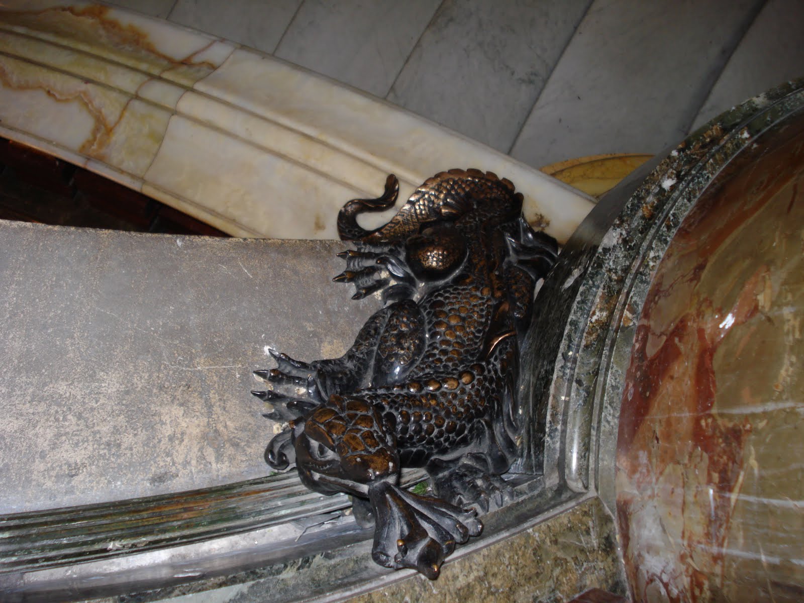
One of my favorite buildings, however, was the Paris Opera; also known as the Opera Garnier, after its architect, Charles Garnier. With dozens of types of marble, rich red velvet, detailed mosaics, and glorious gilt plaster paneling, it was overwhelmingly beautiful. Ironically, many of the artists decorating its rooms, quite famous in their own time, have been overshadowed in history by their contemporaries: the Impressionists. Symbols of music and fire are everywhere. Music symbols would be expected, but the fire symbols were surprising. It turns out, the architect was paranoid of fire (rightfully, as there had been fires previously, and gas lighting was the norm), so salamanders and other creatures of fire are everywhere to ward it off.


And, naturally, I had to make the obligatory peek into Box 5, having just finished reading The Phantom of the Opera a month or so prior to the visit.

Versailles


I was a little surprised by Versailles, to be honest. I've done a lot of tours of historical houses and things, and it was rather bare comparatively. There were lots of decorations, and the wall-coverings, paintings, and ceilings were magnificent, but the rooms were sparsely furnished. I suppose that's because of the multitude of revolutions France had, but the audio tour was also surprising. The rooms would be covered with paintings and beautiful clocks or things, and it would talk for 2 minutes about the function of the room before directing you to move on.
I was fascinated by all of the minuscule details, such as the gilt patterns of the doors, designs on the carpets and wallpaper, and especially the clocks and other objects the often decorated the mantles. I even spotted an ostrich egg! I saw another in England at Windsor, but was unable to take a picture of it.

I also saw a stunningly modern clock. Sadly, this was about the best image I could get of it, since it was behind glass. It was from 1754, believe it or not!

However, the gardens were gorgeous. I could have spent days in the gardens alone. We didn't get to see nearly one third of the gardens, and if I ever have the chance, I am most certainly going back!


03 June 2010
Germany 2


We spent most of our time in Germany searching for places our family came from. Small towns and smaller churches where great-grandparents^3 or ^4 were married were our main areas of exploration. The German sign guarded the entrance to the Wustrow Peninsula, which has been closed off for many years. The fencing stretched all along the peninsula, even extending a short distance into the Baltic sea.


After that rather bleary sight, it was a relief to explore the church in Rerik; the pictures also don't give a sense of how horribly cold it was. I always love all the little details you can find in churches. For example, delicate carvings on pews, or paintings on the ceilings. I also enjoy stained glass windows, though they are quite hard to get pictures of that look decent (at least with a point-and-shoot camera).
02 June 2010
Travel Inspiration
While I travel, my best friend tends to be my camera. This trip, I had to buy a new memory card, I took so many photos (by the way, souvenir shops on the way to Musee d'Orsay- ripoff on memory cards)! I figured I'd start with Germany, since we only spent one or two days in London, and I want to keep my museum visits in separate posts.

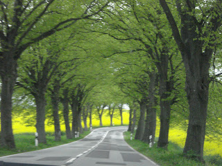
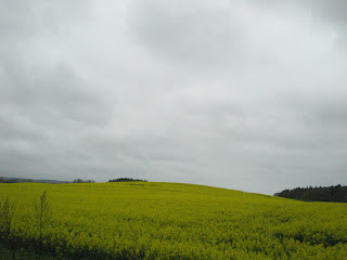
These three images are of the mustard fields in Germany. The first is from along the road from Hamburg to Rostock, and the other two are from Rostock to Rerik and Rostock to Berlin. Having traveled by train in the US, and driven, etc, and growing up in the suburbs, such vast amounts of farmland are astonishing. Not only farmland, but primarily mustard crops. I'd never seen mustard in anything other than a jar before, and the color, even on cloudy days, took my breath away. As I mentioned in an earlier post, there were often trails or green or brownish fields bordering the mustard, leading me to the idea of a bright yellow egg with green or brownish trails.


These three images are of the mustard fields in Germany. The first is from along the road from Hamburg to Rostock, and the other two are from Rostock to Rerik and Rostock to Berlin. Having traveled by train in the US, and driven, etc, and growing up in the suburbs, such vast amounts of farmland are astonishing. Not only farmland, but primarily mustard crops. I'd never seen mustard in anything other than a jar before, and the color, even on cloudy days, took my breath away. As I mentioned in an earlier post, there were often trails or green or brownish fields bordering the mustard, leading me to the idea of a bright yellow egg with green or brownish trails.
Subscribe to:
Posts (Atom)